
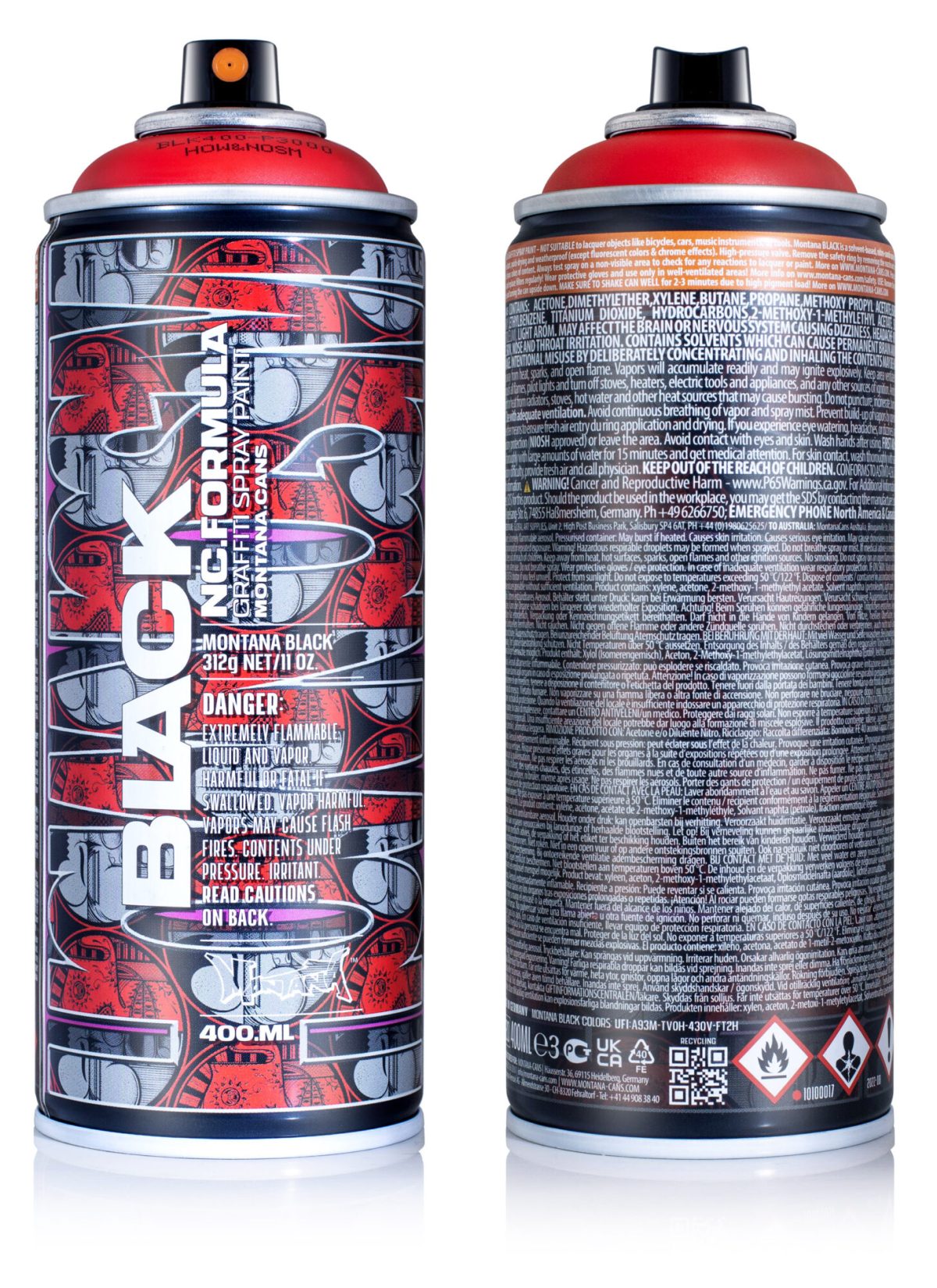
The 24th edition of the Montana BLACK Artist Edition cans is now available. For the 24th in this iconic series, the Montana BLACK color P3000 Power Red had a loving makeover by the New York based twin brothers and artist duo, HOW and NOSM (HOWNOSM)
P3000 Power Red
Also known as Raoul and Davide Perré, the colors black, white, and red have played an integral role in their color palette for more than a decade. What started as an act of necessity while on a painting trip in Brazil, eventually turned into a conscious choice that these days functions like an international calling card for their work. Although their works currently also explore the integration of other colors, black, white, and Power Red are still the three main players in their color spectrum.
The power of red

HOWNOSM murals and artworks can be seen, have been collected, and are adored all over the world. Even the names HOW and NOSM are seldom heard independently of each other, a connection that highlights an ultimate example of creative partnership, synergy, and discipline like the word HOWNOSM itself. They have been working together as a team for as long as they have been alive. Born in Spain, growing up in Germany, and later moving to New York, it is clear that their worldly perspectives have contributed to their global success. That, and their ability to adapt whether it be multilayered fine artworks, prints, or multistory murals with the same intensity.

The names HOW and NOSM are seldom head independently of each other
After having had an in-depth discussion with HOWNOSM a few years back in the Montana Lookbook and blog, we learned more about their philosophies and art-making practices. An experience that makes their design for the 24th Montana BLACK Artist Edition can even more engaging. This prompt led us to ask a few questions that might help us understand the roots of their design.

MC- How did your involvement with the 24th Montana BLACK Artist Edition can come about?
How&Nosm- Well, we have been friends with many of the former Montana Writer Team artists such as Atom and Smash for quite a while, and also know the humble beginnings of Ruediger when he first started selling cans out of his garage in Heidelberg. Montana also sponsored several of our projects in the past so it is needless to say we have a close relationship with the people at Montana Cans and the brand itself.
Atom aka “der Lange” reached out to us sometime last year and pitched the idea of the How and Nosm x Montana Black limited edition artist can. Being that we were already friends and trust each other, we pretty much agreed right away. And we have to say that we had all the creative freedom we could’ve asked for while designing this can.
MC- was there any element of the design process that either of you preferred or took a lead on?
H&N-We have designed a limited edition can for another brand many years ago, so we wanted this can to look differently. When we create designs for products we often use our signature Splitface icon, which is a fusion of How’s and Nosm’s characters that were at some point merged into one. It is also our company logo. We also decided to include some sort of lettering this time around and decided upon a simple readable font due to the limited space on the spray can.

MC- Tell us about the symbolic faces or icons that seem to repeat up through the design. What is their origin and what do they mean to you?
H&N- As mentioned above, the so-called Splitface is a fusion of both of our character styles. How always painted a round more human-looking face while Nosm painted a round skull looking face. One day we just agreed that it would be more effective to make one out of the two. It kind of resembles how we both work together as business partners and as twin brothers. Our crew RAL, Right And Left (Seen UA called us that one day and we stuck with it) go with that logo since each of us paints one of the sides of the Splitface. Over the years the icon started to stand for several meanings such as the balance of opposites, good and bad, life and death, heaven or hell, and so forth. You get the idea.
MC- The choice of using a sleek UV coating on the design brings out the letter elements. Was that incidental or in the plan from the beginning?
H&N- No, working with the creatives at Montana that suggested we could use that on our design and they showed us how it would look. We liked it better so the decision was easy.

MC- Marrying the words How and Nosm to form HOWNOSM (without and or spacing) seems to work perfectly for this vertical can design. As you are connected in so many ways, is this something you embrace, or are there ever any moments where you actively separate HOW and NOSM to symbolically acquire space for yourselves independently?
H&N- HowNosm seems more like a logo or brand name with more of a punch line than How and Nosm, but we use both frequently. It all comes down to how we feel it fits accordingly to the context we are applying our name. For this can, we decided on the shorter version just because of the limited space on the can. We do paint our names separately from time to time and we have our own styles within “How and Nosm”. If you know us well you can tell us and our styles apart otherwise you might have difficulties.
MC- What’s the best thing both of you like about your brother?
H&N- Being brothers lol
The 24th Montana Artist Edition can is likely to become as iconic as HOW and NOSM themselves. Don’t sleep on this one and secure yours as soon as possible. Available only while stocks last.